
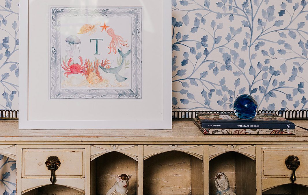
I think the difference between a room that feels just decorated and one that feels truly designed often comes down to pattern mixing. The best British interiors never feel overly matched or too “done”, they feel layered, collected and naturally lived in.
Think classic London townhouses or cosy countryside farmhouses – layered florals, timeless stripes and softer contemporary prints all working together in a way that feels collected over time, not overly coordinated.
It’s this balanced, layered approach that gives a space warmth, personality and depth. The goal isn’t perfection, it’s harmony.
If you want your project to feel more elevated, characterful and considered, here’s how to mix wallpaper patterns with the confidence of a British interior designer.
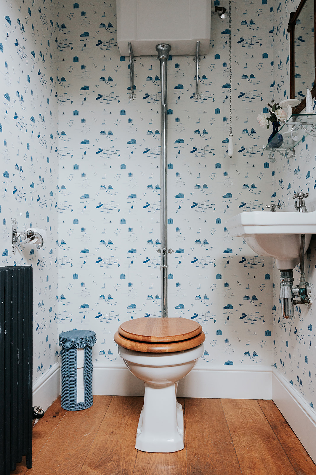
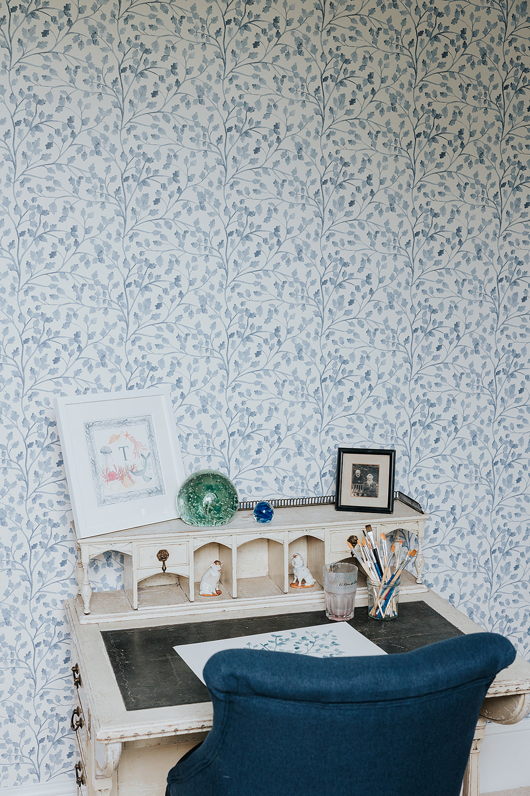
1. Start with a “Hero” print
Every well-designed room needs one statement pattern that leads the scheme. In British interiors, this is often a wallpaper with real presence — a flowing floral, a hand-drawn botanical or a large-scale scenic print.
Your hero print sets the tone for the entire space. It usually becomes the starting point for the colour palette and helps guide every other fabric, texture and smaller-scale pattern layered around it.
Once you’ve chosen it, everything else should support it rather than compete with it.
A simple rule designers often follow: if your main wallpaper is quite detailed or “busy”, balance it with secondary patterns that have a little more breathing room. It stops the space from feeling overwhelming and helps the whole room feel more considered and cohesive.
- The Designer’s Rule: If your main wallpaper is quite detailed or “busy”, balance it with secondary patterns that have a little more breathing room. It stops the space from feeling overwhelming and helps the whole room feel more considered and cohesive.
2. The Rule of Three: Scale is Everything
One of the most common mistakes when mixing patterns is choosing prints that are all a similar scale. When everything competes at the same size, a room can start to feel visually busy and slightly overwhelming.
Instead, try layering patterns in different scales throughout the space.
1. Your largest-scale print is usually the hero wallpaper.
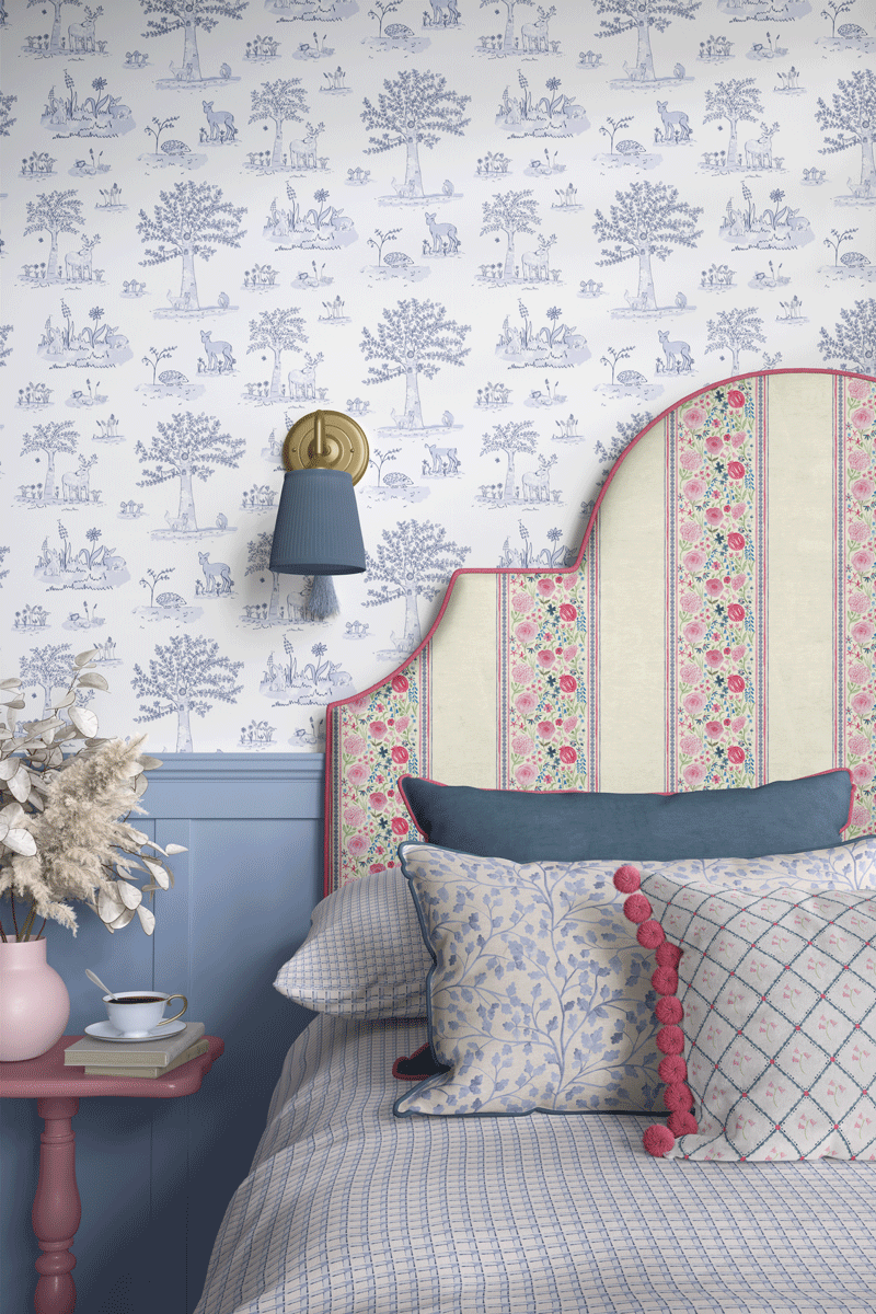
2. From there, bring in a medium-scale pattern — something like a soft check, subtle stripe or smaller floral on upholstery, curtains or a headboard.
3. Then finish with smaller-scale details, like a ditsy print, ticking stripe or simple geometric on cushions and accessories.
Varying the scale helps each pattern stand out in its own way and gives the room a more balanced, layered feel that looks considered rather than overly matched.
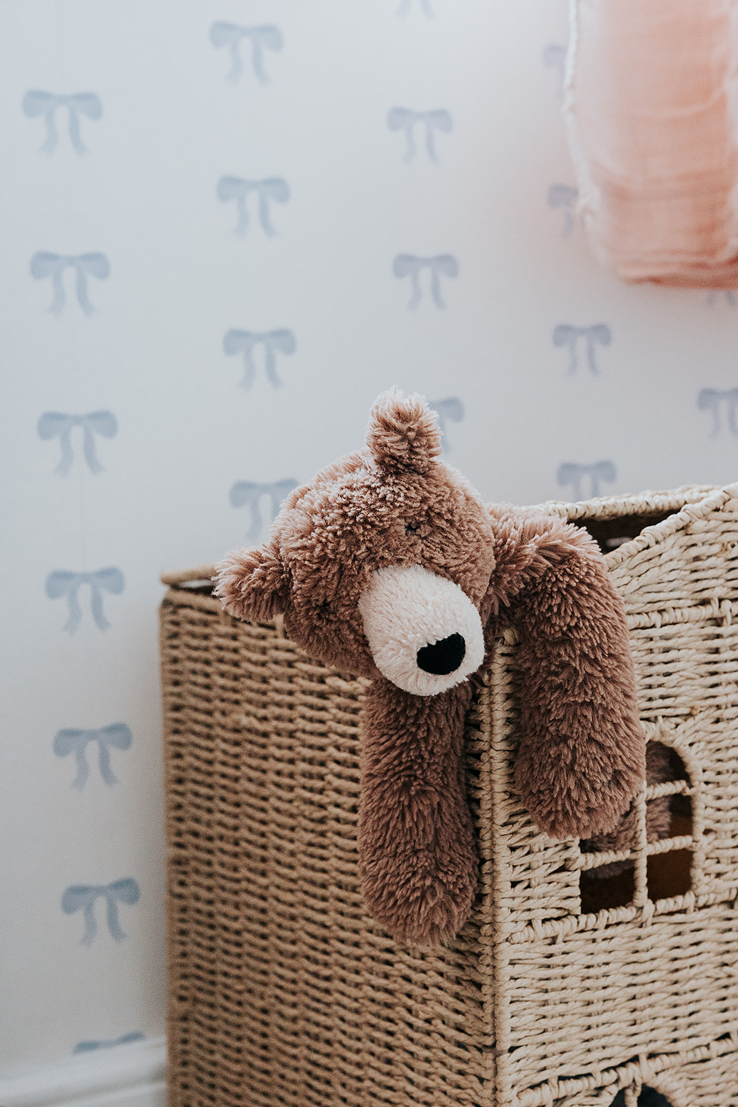
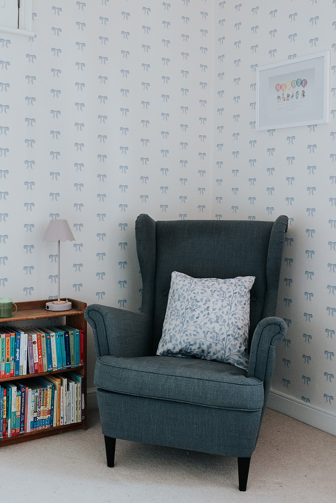
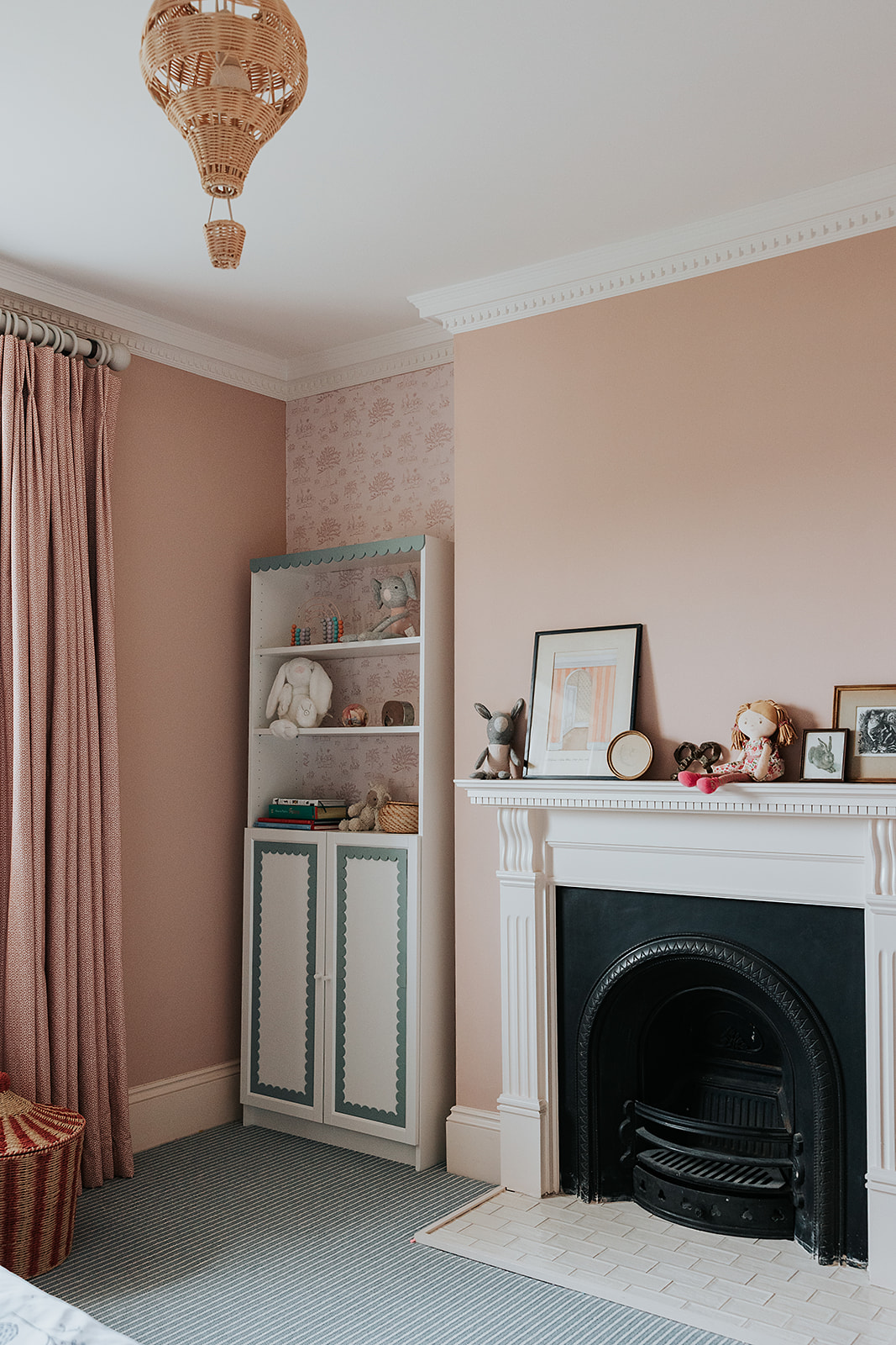
3. Use a Consistent Colour Thread
4. Contrast Organic with Geometric
The best pattern mixing usually comes from contrast. If your wallpaper has a softer, more organic feel – like flowing florals, climbing vines or painterly shapes – it helps to balance it with something more structured.
That’s where stripes, checks, herringbone or other linear patterns work really well. They add a sense of order and stop the space from feeling overly decorative or too “sweet”.
It’s that mix of soft and structured elements that gives British interiors their layered, balanced feel.
5. Don’t Forget the “Breathing Space”
Even the best layered interiors need moments of calm. When you’re mixing patterns, solid colours and natural textures are what give the room balance.
This could be a plain linen sofa, timber flooring, simple upholstery or even an unpatterned rug or curtain. These quieter elements stop the space from feeling too busy and allow your wallpaper and statement patterns to really stand out.
The goal is for the room to feel layered and interesting – not overwhelming.
6. Consider how patterns flow from room to room
In a home, you’re rarely experiencing one room completely on its own – you’re moving through spaces and seeing them together. That’s why it helps to think about how wallpapers and patterns connect from one room to the next.
The colours, tones or overall mood don’t need to perfectly match, but they should still feel related. For example, a softer textured wallpaper in a hallway can lead naturally into a bolder patterned space beyond without feeling too abrupt. Or you can use a colour to as a running thread between the two.
When there’s a sense of flow between rooms, the whole home feels more considered, cohesive and easy to live in.
Bring the Vision to Life
Pattern mixing is really about creating a home that feels layered, personal and reflective of your style. The spaces that feel the most interesting are usually the ones that don’t look overly matched or too “perfect” – they feel collected, balanced and lived in over time.
The key is finding a common thread between the patterns you love, whether that’s through colour, texture, scale or mood. Once you have that, you can be a little more confident and creative with your choices.
Our collections are designed to work beautifully together, making it easier to layer different prints, textures and tones throughout your home while still keeping everything feeling cohesive and considered.
Are you ready to create a home with a story? Explore our Hand-Drawn Collections and find your Hero print today.